Teaching Product Teams to Fish for Themselves – March 2023 Wrap

For our March session of Product Anonymous, we were fortunate to be joined by Amir Ansari, Global Head of Product Design at Iress, to share some of his experiences with raising design maturity and capability in his organisations, and it may not be how you would initially think.

Appreciation of Product Design

Over recent years, many more companies have started to appreciate the value of product and design. And as an industry, we’ve seen a bit of an explosion in growth. Many companies have bolstered their design teams, and transformed the way they work. 

  • Atlassian grew 1600% or 16x in 4 years (6 to 106 designers)
  • Coles grew 550% or 5.5x in 1 year (10 to 65 designers)

But how many designers are enough?

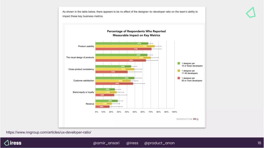
Is it even about the number of designers? Or more about the ratio of designers to developers?

So what’s the best path for designing and building better products? Is it to hire a bunch more designers, and get the ratio down? Some implications of this approach may be your increase in overhead, and the need to change your operating model, which is not necessarily a terrible thing. However, surely there’s a more scalable way to grow.

In fact, according to a Nielsen Norman Group article, the typical ratio alone does not ensure greater organisational impact, better designs, or more usable products.
The Challenge – How might we Improve Design Maturity…

When we talk about Design Maturity, we’re talking about:

  • Product Design
  • Innovation
  • Human Centred Design
  • User Experience
  • UI design
  • Visual Design
  • Service Design

Back to that designer to developer ratio. For Iress, the ratio is 1:35. Or 1 designer working across 5 squads. That’s 14 design practitioners, grown over 20 years, covering 120 products. When it comes to design, Iress still falls short of a minimum acceptable amount of practitioners.  

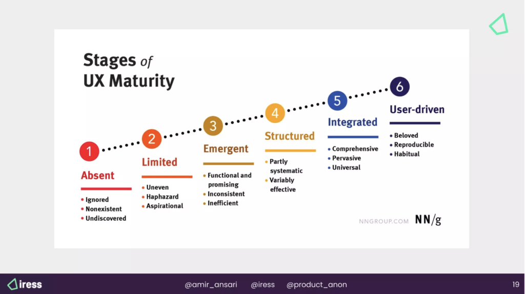
An assessment against NNgroup’s stages of UX maturity would be between 1 and 2, with obvious aspiration to move towards a 6.

So therein lies the challenge – how might we improve the design maturity, without unrealistically increasing UX headcount.

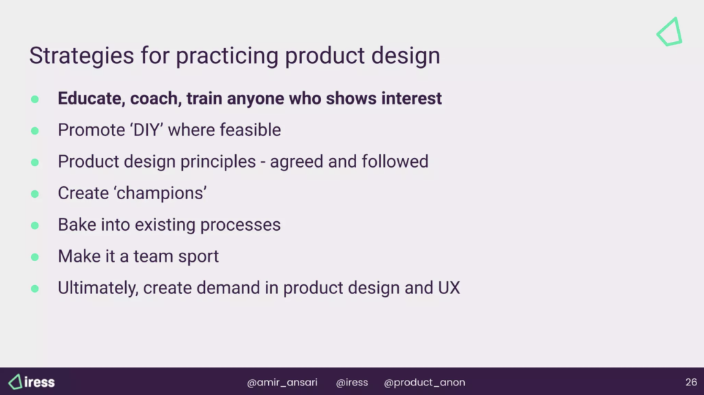
Guiding Principles

As the old adage goes, If you give somebody a fish, you feed them for a day. But if you teach somebody to fish, you feed them for a lifetime. 

The same goes for design – to increase design maturity, don’t just rush to increase design headcount.

Over the past 15 years, one of Amir’s fundamental principles has been to democratise the craft of design – to teach and empower everybody within the organisation to practise design, from customer research, to experimentation, validation and much more.

Ensure everybody has the confidence and is empowered to talk about design. Talk about the product. Talk about the customer. Talk about the end user.

Designers are facilitators of the design process. Not owners of the design. 

Everybody else in the room, from Business Analysts, Quality Assurance, Engineers, Product Owner and Product Managers all have a perspective and opinions too. Use the right toolkits to validate those opinions.

“Do the best you can until you know better. Then, when you know better, do better.”

Maya Angelou – American Philosopher

Nobody can be an expert straight away. Mastery comes with practice. So continue to practise and build that muscle.

Don’t start by putting slide decks together to pitch for why design should be more valued, or why you hire more designers. Rather, get out there with the clients, and start doing design work, and showing value. Use that newly created value as the enticement to invest more in design.
Strategies

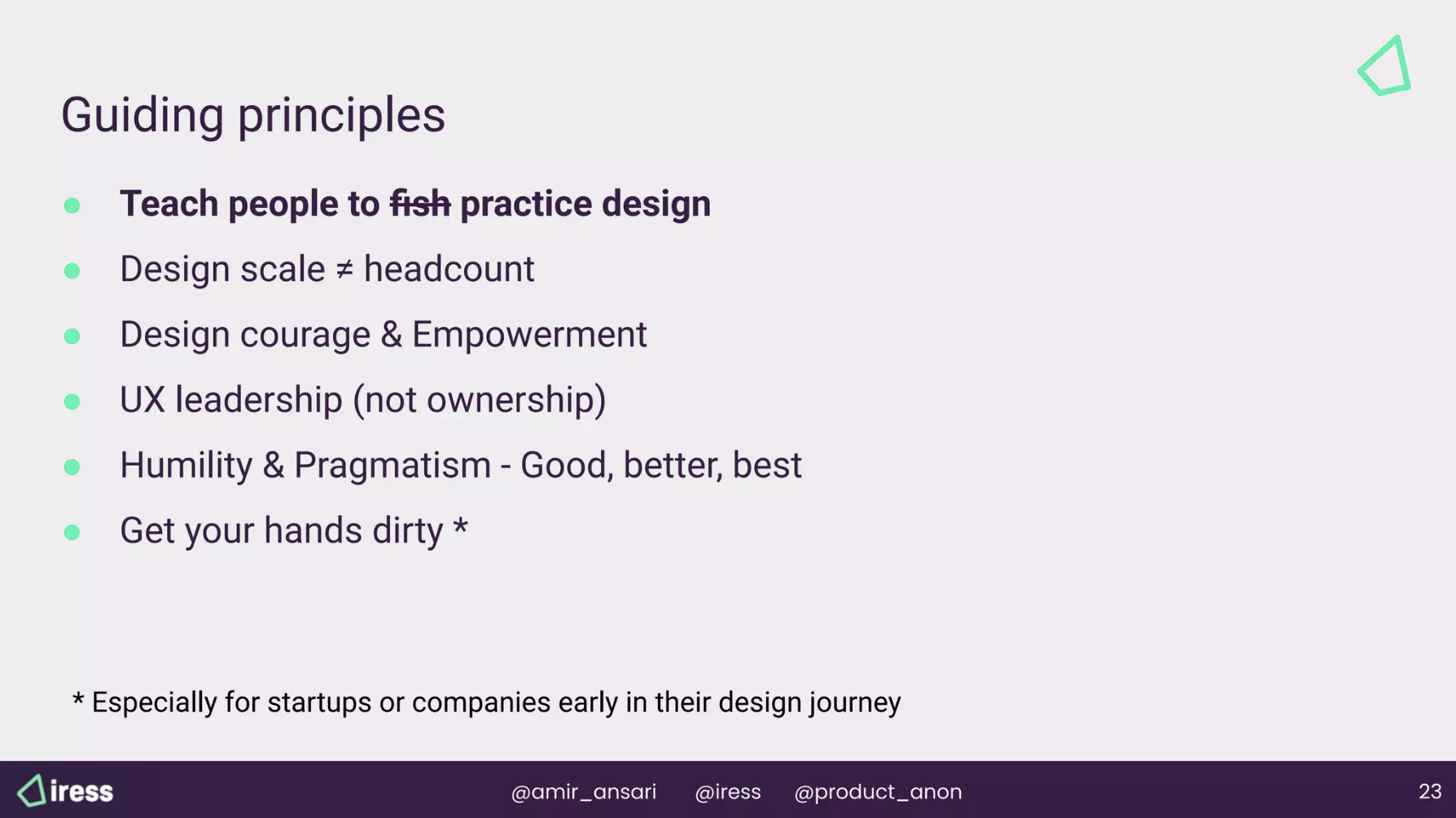
Educate, coach, train anyone who shows interest, and promote DIY. 

When Amir first started at Iress, there were only 6 designers to support 700 engineers. Way too many to try to teach every single engineer about design practices. So one of the first things they did was to document their playbook, starting with some of their most common human-centred design activities that were relevant to Iress. And without jargon, so that non-designers could understand and follow too.

A typical Playbook Topic skeleton could include:

  • What is it?
  • Why should you do it?
  • When should you do it?
  • How to do it?
  • Resources and templates
  • Skill level required
  • Typical duration

This way Business Analysts, Product Managers and others could read the content, reach out for guidance, and give the activity a go.

Following the activity, the design team would debrief them – how did it go? What worked, what didn’t? Try this next time. Essentially, helping team members add another tool to their toolkit.

The design team also tracks the playbook engagement. Who is visiting, and from which disciplines? Which topics are being used? Are some topics being neglected? Do they need to run campaigns or refreshers to get people to re-engage?

Create champions

It’s important to reduce the friction for non-designers to get involved, learn and talk about the design craft. At Iress, they introduced communities, and have created over 25 design-specific slack channels, some around design-related themes (eg, the Iress Design System), others based on region (eg, for Melbourne Product Design Team, or the UX Research Enthusiasts UK channels).

Also, after running design activities, Amir’s team gathers feedback and measures the sentiment of non-designer participants about the process. Was it valuable? Could something be done better? Would you come again? Build interest and iterate the process so that people want to return.

Bake into existing processes

When you’re trying to change the way people work, there is always going to be resistance. Everybody is already overworked. Reduce the barriers. Break up the processes and the craft, and insert smaller portions into existing processes.

Product design principles – agreed and followed

The Design Team (or one of their principals) created a design charter, or a set of principles, that the team could easily and quickly refer to, so regardless of where they were in the design or build cycle, they could check that they were on track. Have they removed their biases? Did they understand what success would look like? And can it be measured? 

Make it a team sport

Design is a team sport. We all work for product companies. We are all responsible for delivering value to the customer through the products we build.

Create demand in product design and UX. 

Show value from the UX craft, so that more people want to join in and share the same
Beware, some of the Traps

The Dunning Kruger Effect

After you’ve coached somebody, and they’ve read a bit of material from your playbook, and even run an activity, there’s a danger that they overestimate their ability. There is a chance that they start to erode the craft of design. 

Constant education and reinforcement is required. 

  • Did you know you only need 5 users for meaningful research? But did you also know you should have asked the user this, and you should do that. 
  • Did you know if you run a design sprint, you need to prepare x, y and z?

If you build it they will come

You cannot assume that just because you’ve taught a group of people once, that they will continue. Everybody has their own work to do, and their own agendas. Again, constant education and reinforcement.

Thank you

Thank you so much to Amir for sharing his insights; our volunteers – Gwen, Nosh, Sakthee and Steve; and our event host – SEEK.

Further reading and resources

Some resources mentioned during the session include:

Reece’s Secret Sauce to Product Success – October 2022 Wrap

How well do you really know your customers?

Do you have to reference a user testing report to try to understand their needs?

When you are designing and building solutions, how easy is it to test your assumptions?

Do you need to kick off a testing with a 3-4 week lead time, to recruit, book and run sessions?

Could there be another way?

The folk at reecetech thought so. 

Immersion, Immersion, Immersion – Branch Time

Starting from their grad program, and soon proliferating throughout the rest of their teams, new Reece employees are given an induction like no other. They are sent to one of the 644 Australian branches to immerse themselves in the business.

It’s back to apprentice mode, as you get first hand experience of the customer sites. The 7am morning rush, helping setup customers, picking and packing orders which come in from all areas (overnight orders, phone, app and in-person), receiving stock, organising deliveries,  reporting back when things don’t go quite right. And seeing Reece’s customer obsession service standard for yourself.

Not just for research purposes, or standing on the sidelines taking notes. But by working side by side with the branch staff, serving customers. 

Everyone has done Branch Time. 

Even the CEO.

How long can vary for different areas, depending on their needs. But the standard stint for a Product Manager is around 6 weeks.

The Pros and… More Pros

But sending every new hire to Branch Time is a serious commitment – in both time and dollars. 

So what’s the upside?

Firstly, accelerating your understanding of the business, and building a strong foundation to make decisions in the future. This is not always tangible or measurable by reporting, but what better way to fast-track your decision making capability?

Also, forming connections and relationships with the branches, and understanding the mayhem of retail. You even get direct experience with using Reece’s internal systems, such as TRS. You always have access to feedback, as you’re constantly in contact with branches. 

And, of course, establishing deep empathy with your customers, the majority who are tradies. Understanding and becoming intimate with their customer problems, so you can ensure the right solutions are developed to deliver the right outcomes. Knowing their world also enables you to contribute and create meaningful OKRs (targets). 

But it doesn’t stop there: 

  • Branch managers and staff also benefit from building relationships with somebody in head office.
  • After Branch Time, you have ongoing access to the branch network, to continue to foster relationships, to interview or to validate ideas and concepts with staff or customers. 
  • New team members also go through the same Branch Time experience, so there is a shared understanding and common ground established.

Thank you

Thank you again to Cameron Rogers and Nikki Pecora from reecetech for sharing, to our volunteers (Nosh Darbari, Yau Hui Min, Steve Bauer) and to our lovely hosts Lexicon and A Cloud Guru.

Encouraging Ethics Conversations – May 2020 Wrap

In recent years, the harm caused by technology has come under greater scrutiny. Whether at an individual product level, or the ecosystem created by a combination of products. 

  • How can we anticipate and mitigate against harm?
  • Bring an ethical lens into the product design process?
  • And map the potential bias in the systems we create.

If you’re struggling to find an answer, you’re probably not alone. 

After numerous years working in tech companies and startups, Laura Summers identified a lack of tools to facilitate ethics conversations. This led Laura to found Debias.AI, and create Ethical Litmus Tests – a deck of cards with prompts and questions to help reframe a scenario, and apply different lenses during the design process.

We were fortunate to have Laura join our May session, and using the Litmus Tests, take us through an interactive exploration of ethics in product design.

https://twitter.com/summerscope/status/1263290459217989639

Why is it so important?

Making trade-offs is part of designing and building products. But have you ever deeply considered what the impact of those options could be? Do you justify the decisions with yourselves, for the net (or greater) good?

But would you feel comfortable explaining your choices to a close younger relative?

Or what if the user was your elderly grandparent?

By applying these types of lenses, would you change the way you approach these decisions?

How does the Ethics Litmus Test work?

Define the motivator or driver

Describe the problem or scenario. The motivating concern can be either broad (eg, I’ve got a niggling feeling about this outcome), or very specific (eg, what if data was misused). 

Pick a litmus card at randOM

Select a card to help you reframe your view.

Write down your responses individually

With the litmus card in mind, spend a couple of minutes to consider:

  • Opinion: your position to the scenario
  • Questions: if you need to know more information
  • Next steps: action items

Share your responses

  • Compare and contrast your responses. 
  • Are you surprised?
  • Explain your thinking.

Some alternative activities to share your thoughts and responses:

  • The Blind Advocate – pass your response to another participant, and take turns to argue for another person’s opinion. A true exercise in empathy!
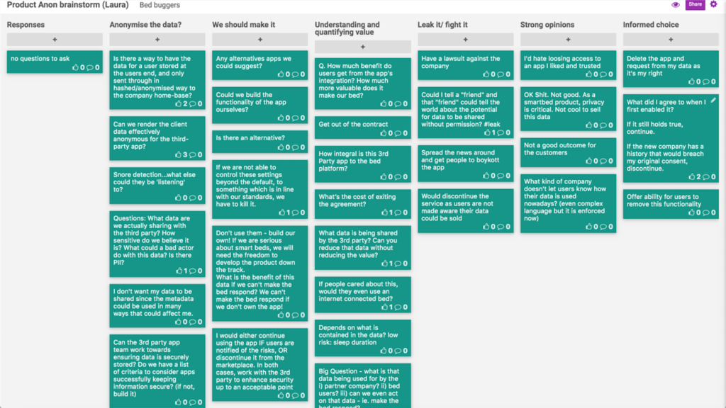
  • The Brainstorm – good for bigger groups, share your thoughts on post-its, or a digital retro board (like FunRetro), and then you can sort the responses into themes.

In this session, we all had some practice and fun, as Laura ran through several interactive scenarios with the Litmus Tests. Using the breakout rooms, we were able to discuss each scenario in small & bigger groups.

Resources and Further Reading

Read more about Laura and her work:

Thank you to our host: A Cloud Guru

Thank you to A Cloud Guru for hosting us online again this month. A Cloud Guru’s mission is to teach the world to cloud. We’re hiring

February Wrap-up: Rogue UX

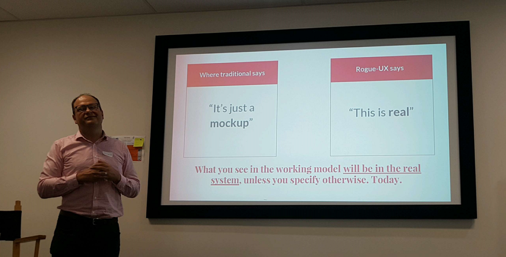
Duncan Macneil thinks UX needs a new approach which immediately puts the focus on the UI, functionality & user experience – and that new approach is absolute fidelity.

Prototype Fidelity

Traditional vs Rogue UX

Traditional vs Rogue UX

Duncan believes you will:

  • save money as it will iron out the bugs & solves problems before developers are brought into the process. For every $1 invested here you save $3 or 5 or 10. Removing a guess is removing development
  • save time by decreasing the back & forth between developers & others in understanding all the requirements
  • save time by encouraging stakeholders to make decisions right then instead of sometime later plus puts focus on the core business decisions
  • be able to generate a buzz amongst the stakeholders as they have something immediately to play with & show off to others (which leads to funding!)
  • bridge the artificial gap between design & development

In conversations with developers, Duncan has asked how long it took to build X and if he were to delete the code, how long would it take to rebuild it – six months vs 1 month since during the rebuild the person knows exactly what they need to do and what problems/solutions were needed.

Since the prototype looks so real, no one in the room is thinking ‘I’ll sort that out later’. It adds a level of fear & panic in stakeholders that they bring up issues right away.

Show your stakeholders the simplest user case & once they leave get into the nitty gritty detailed cases with the people that really care.

If at all possible, hook the prototype up to real live APIs. This is incredibly useful when someone asks about a particular edge case and when running various user scenarios.

How can you do this?

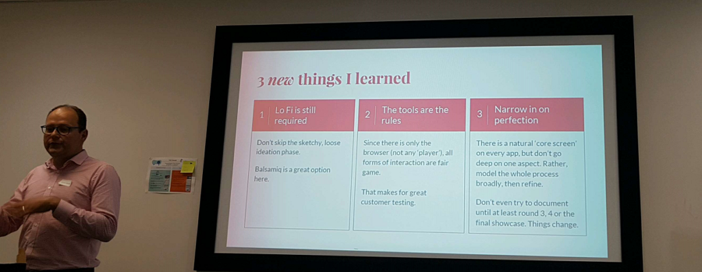
Duncan believes in starting with low fi (paper or balsamiq) then going right to absolute fidelity.

Use your low fi to sketch and make the big changes.

He recommends using a beginning to end process – UI layer from beginning to end, then data from beginning to end. Focus on the UI, data and business rules. Typical functionality around login, backup, reporting do not need to be included (unless of course you’re building a reporting product).

Make it as real as possible! Know the current search is taking 3 seconds to return? Build a delay into your html.

What do you say when stakeholders think the prototype is a finished product ready to launch tomorrow? Talk about the backend items that are needed – security, backup, databases and other technical aspects that need to be built.

What tools are needed?

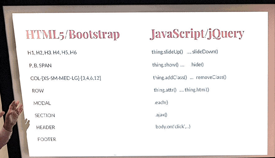
Having some knowledge of HTML5, Bootstrap, Javascript and Jquery is enough.

Code you need to know

Code you need to know

Duncan also recommended using Balsamiq and Pinegrow web editor.

3 learnings

3 learnings


If you are interested in continuing the conversation, join Duncan’s list at http://uxrogu.es/ or check his site.

Thanks Thoughtworks for hosting us!

Thanks to Fiona Knight & Richard Burke for helping pull together this summary!

Mapping Experiences – Session wrap-up

Thanks to Aconex, UX Melbourne and the UX Design Group of Melbourne for inviting Jim Kalbach out to Oz and pairing with us to host this event.

Jim is the author of 2 books: Designing Web Navigation and his latest Mapping Experiences. Our focus for the evening was mapping experiences.

Currently, Jim works at MURAL which helps teams design together when they are working remotely. He started out as a librarian, moved into the information architecture direction – which finally landed him in the UX space. He spent some time at Citrix leading with the design experience across the SaaS communications cloud.


[pullquote]”Start with the customer experience and work back to the technology, not the other way around” Steve Jobs, 1996[/pullquote]

Getting the Apple reference out of the way early :-), Jim talked about the need for the customer to come first with everything you do which will in turn create value for the business. Steve Jobs wasn’t the first to talk about this concept though as Jim shared a reference from Theodore Levitt.

[pullquote]that businesses will do better in the end if they concentrate on meeting customers’ needs rather than on selling products.” Theodore Levitt, 1960[/pullquote] In 1960, Theodore coined the term ‘Marketing Myopia’ and talked about the value comes from the customer.

With the scene set for customer focus, Jim took us through his four principles.

  1. Survival requires a reversal in business thinking: start with the experience and creates value from there.
  2. The aspiration of design should be more than “delight”. We help re-align the business perspective by visualising (actual) value.
  3. Mapping experiences leverages our design skills to become facilitators and grass roots leaders in the organisation
  4. Shift your measure of progress from generating and testing ideas to validated learning about your riskiest assumptions.

Survival requires a reversal in business thinking: start with the experience and create value from there.

Maps help with visualising value.

A beautiful example Jim used showed the process of buying a house, mapped out by Sofia Hossain. Sofia uses a circular style for her visualisations which really stands out. This style also shows the contribution of external vs internal activities

Most of the experiences a customer has will repeat themselves. There may be a long time between buying your first house til the next time but the cycle starts again in the same way each time.

An example of her work on planning events is here. .

The individual and the organisation overlap by a certain amount and that overlap is where the “exchange of value” occurs. This set of interactions or touch points is where it can all go marvelously wrong or beautifully right. If you don’t understand what these are you can only keep throwing solutions at symptoms instead of fixing the problem permanently.

This is where Alignment Diagrams become are great. They’re useful and important to help you understand these points of interaction plus help you communicate the situation to others in your organisation. Use them to help build brilliant products & to communicate what needs to be involved to resolve problems faced by the customer.

A couple of examples of different ways to do customer experience maps included mental models (Indi Young) and spatial maps (Paul Kahn), but anything that makes it visual and drives conversation falls into the group of alignment diagrams. 

The aspiration of design should be more than “delight”: We help re-align the business perspective by visualising (actual) value.

The designer needs to be a facilitator for a broader conversation in the organisation.

You are driving all the steps: 

  • Initiate
  • Investigate
  • Illustrate
  • Align
  • Envision

 An experience map by being visual and drawn together in a collaborative way becomes a “campfire that draws people in” to talk and huddle over. This metaphor is particularly powerful to remember the purpose of these efforts and a reminder that if a team is working on a map but it is hidden away in a room where no one can see it, then it isn’t doing its job.

One has to follow through with the information gathered and run experiments to prove a solution will work. It is pretty easy these days to prototype, test and thus learn. Be careful with your definition of MVP…..

Again a process to encourage Empathy, expand out to Envision, converge again as you Evaluate and then Plan experiments to learn.

Mapping experiences leverages our design skills to become facilitators and grass roots leaders in the organisation.

An organisation already has more than enough ideas. Ideas are overrated and assuming the best idea will just rise to the top is not owning the outcomes. To find the kernals within ideas that are worthy of being implemented, you need an active process. Use a hypothesis format to ensure concepts are properly tested & evaluated. The structure below starts with ‘we believe’ as it sets the stage to help remind youself that you don’t know.

We believe providing [individual, customer, user] with this [feature, solution, service] will result in this [desired outcome].We will know this when we see [measurable result].

Shift your measure of progress from generating and testing ideas to validated learning about your riskiest assumptions.

Jim’s last point is a good reminder! Often we focus on “proving out” ideas and concepts and possibly we are just adding to our confirmation bias – whereas what we really want to know is what we don’t know!

Thanks again to Aconex for putting on a fabulous event and coordinating this fantastic opportunity!

Jim’s slides:


RSVP for our next event on April 14th – Roadmaps: Friend or Enemy?